Longform Context UX
Study 04/08Captured 2026-07-11

Nielsen Norman GroupResearch Guidance

Homepage Design: 5 Fundamental Principles

NN/g combines a direct summary, numbered contents, restrained serif reading column, and repeated annotated examples. Desktop keeps related courses in a bounded side rail, while mobile defers that material and turns the contents into a compact sticky surface, making the layout genuinely recomposed.

Open the original article

Verdict

A disciplined professional article whose explicit argument map, evidence-caption pairs, and responsive orientation tools make an unusually deep page feel dependable.
Evidence limits. This is a single-session visual and DOM inspection, not analytics or comprehension evidence. Full-page images are height-capped overview strips useful for pacing, not fine detail or exact GIF state.

What changes, and what merely resizes.

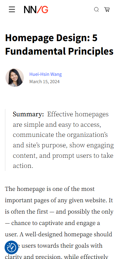
This evidence pair keeps the first viewport constant enough to compare hierarchy, media priority, and the cost of adaptation. Classification: recomposed.
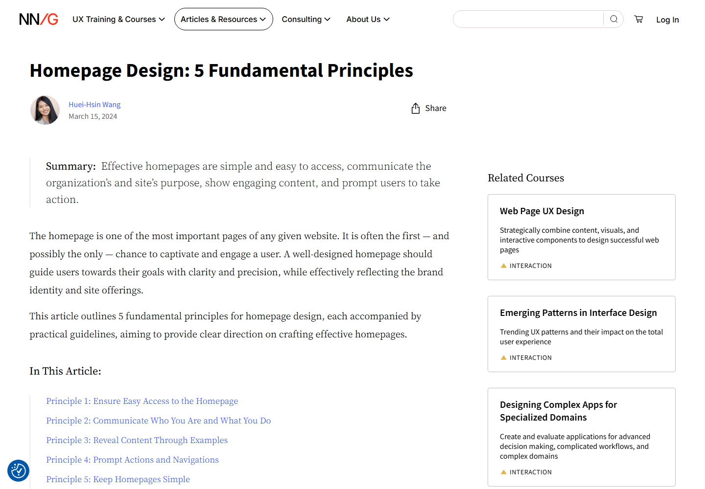
Desktop first viewport showing the original page hierarchy and composition.
Desktop, 1440 × 10002026-07-11
Mobile first viewport showing how the original page adapts its hierarchy and composition.
Mobile, 390 × 8442026-07-11

How the article spends attention.

  1. 01 Article contract

    Headline, author, date, share utility, and a bordered one-sentence summary establish scope immediately.

  2. 02 Argument map

    A five-link In This Article list names the numbered principles before the long evidence sequence begins.

  3. 03 Principle chapters

    Five descriptive sections pair recommendations with interface screenshots, GIF demonstrations, and evaluative captions.

  4. 04 Qualification

    A durability section tests how the guidance holds over time rather than ending after the fifth rule.

  5. 05 Learning ecosystem

    Related courses, topics, articles, newsletter, and institutional footer extend the professional-learning journey.

Two compositions, one editorial promise.

Desktop observations

  • At 1440px the article uses an approximately 868px reading column beside a roughly 384px related-course rail.
  • The 40px headline, 20px serif prose, 37px line height, and generous paragraph spacing prioritize sustained reading.
  • Screenshots generally fill the reading column and remain immediately attached to explanatory check-or-cross captions.
  • The broad global navigation keeps category, search, commerce, and account utilities visible without entering the prose column.

Mobile observations

  • The header collapses to menu, NN/G mark, search, and cart while the H1 reduces to about 34px.
  • Body type remains approximately 20px/37px in a 358px column, preserving comfortable long-form rhythm.
  • The contents becomes a pale-blue sticky or collapsible orientation surface that can expose the current principle.
  • The desktop rail moves after the article and screenshots scale into one column without horizontal overflow.

A representative reading beat

Representative desktop article body showing the source page's reading rhythm, media, and local hierarchy.
Desktop article body2026-07-11
Representative mobile article body showing how the source page adapts its reading rhythm, media, and local hierarchy.
Mobile article body2026-07-11

The system behind the mood.

Typography

  • Source Sans Variable separates headings and interface language from Source Serif Pro Variable article prose.
  • The captured desktop hierarchy is approximately 40px H1, 30px H2, and 20px body; mobile preserves the body size while reducing the H1.
  • The desktop measure is broad, but the loose 37px body line height protects legibility.

Color and imagery

  • White, black, electric-blue links, pale-blue orientation surfaces, and small red or green judgments create a restrained evidence system.
  • Imagery is functional proof: interface screenshots and demonstrations rather than decorative editorial photography.
  • Captions carry the interpretation, so evidence does not depend on visually decoding the screenshot alone.

Motion and interaction

  • The article is largely static, but several interface examples are animated GIFs.
  • No reduced-motion override was detected in the accessible stylesheets inspected during this session.

Orientation is part of the story.

01
Share appears near the desktop article header, and named contents links provide local navigation.
02
Related courses stay in a visibly bounded desktop rail and move after the article on mobile.
03
Orientation is semantic through numbering, headings, and contents rather than a decorative percentage bar.

Access, weight, and reader trust.

Accessibility

  • Strong contrast, clear heading hierarchy, descriptive captions, and mostly descriptive image alt text support comprehension.
  • The inspected author portrait exposed no useful alternative text.
  • Animated examples should be audited for pause controls and motion preference behavior.

Performance restraint

  • Many article images use lazy loading, but the very deep media-rich page still accumulates decode and layout work.
  • No numeric transfer-size, Core Web Vitals, or field-performance measurement was performed.
Readability 5/5
Orientation 5/5
Narrative pacing 3/5
Responsive adaptation 4/5
Media integration 4/5
Accessibility 4/5
Performance restraint 3/5
Transferability 5/5

Borrow the mechanism.

Summary as contract

Give the conclusion before asking the reader to commit to a long evidence trail.

Argument map before depth

Use descriptive section links that explain the logic, not generic chapter numbers alone.

Evidence-caption pair

Keep every screenshot adjacent to the sentence that evaluates it.

Defer secondary conversion

Keep commercial learning options beside desktop reading but move them after the core mobile task.

Keep the lesson. Leave the signature.

  • Do not assume the broad desktop measure suits every typeface or content density.
  • Do not let the sticky mobile contents surface obscure the paragraph being read.
  • Do not ship animated evidence without reduced-motion and pause behavior.

What this asks of the frontend.

01
Use semantic article, on-page nav, section, aside, figure, and figcaption elements.
02
Generate contents from real headings and expose active state with aria-current when enhanced.
03
Use a two-column minmax grid that moves the aside after the article below the content breakpoint.
04
Give evidence media intrinsic dimensions, responsive sources, descriptive alt text, and textual captions.

Read the dated learning file for the full observation log.

The entire scroll, preserved.

Show desktop full-scroll overview Compressed full-scroll desktop overview of the original Nielsen Norman Group page, showing overall pacing rather than readable text detail.
Show mobile full-scroll overview Compressed full-scroll mobile overview of the original Nielsen Norman Group page, showing overall pacing rather than readable text detail.