Longform Context UX
Study 03/08Captured 2026-07-11

Postcards by Elle on SubstackPersonal Newsletter

morning walks and listening to full albums will save you

A centered 728px desktop column combines Lora headings, Spectral body copy, domestic photography, quotations, previews, and resource lists. Mobile recomposes the header and engagement row while preserving a 32px title and a generous 18/28.8px body, keeping the essay's personality intact.

Open the original article

Verdict

A warm, intimate newsletter shell sustains an 8,000-word essay through named movements, personal media, and reader utilities, while Substack's delayed subscription prompt and small controls compete with the calm reading voice.
Evidence limits. Focus order, keyboard behavior, screen-reader announcements, and reduced-motion handling were not exhaustively tested. Subscription overlays were dismissed and existing lazy images were loaded for clean evidence; the Substack shell is mutable and observations are time-bound to 2026-07-11.

What changes, and what merely resizes.

This evidence pair keeps the first viewport constant enough to compare hierarchy, media priority, and the cost of adaptation. Classification: recomposed.
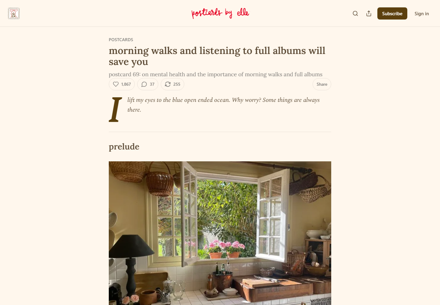
Desktop first viewport showing the original page hierarchy and composition.
Desktop, 1440 × 10002026-07-11
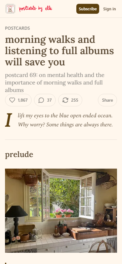
Mobile first viewport showing how the original page adapts its hierarchy and composition.
Mobile, 390 × 8442026-07-11

How the article spends attention.

  1. 01 Publication bar

    Fixed identity, search/share-publication, subscribe, and sign-in utilities with a simplified mobile set.

  2. 02 Article header

    Category, title, subtitle, like/comment/restack counts, and share action.

  3. 03 Epigraph and prelude

    Oversized drop cap and italic quotation lead into a prelude heading and kitchen photograph.

  4. 04 Memoir and walking chapter

    Personal health narrative expands into walking research, philosophical quotations, links, and images.

  5. 05 Full-album chapter

    A second habit continues the argument with screenshots and personal media.

  6. 06 Interludes and postlude

    Reading syllabus, movie/video list, short personal close, and Springtime image.

  7. 07 Platform tail

    Email conversion, engagement summary, comments/restacks, related tabs/cards, second signup, and footer.

Two compositions, one editorial promise.

Desktop observations

  • The article is centered at 728px with 32px top padding below an 88px fixed publication bar.
  • Spectral body text is 20/32px with 20px paragraph spacing; inset callout prose uses a 20px left offset.
  • Lora title type stays moderate at 32/36px while imagery and the drop cap provide opening drama.
  • Full-column and inset media coexist, avoiding a uniform image-card treatment.
  • The loaded page measured about 14,235 CSS pixels.

Mobile observations

  • The article becomes 358px wide with 16px side margins and 16px top padding.
  • The H1 remains 32/36px while body text becomes 18/28.8px and section H3s become about 24.75/28.71px.
  • The fixed bar contracts to 57px and removes desktop search/share-publication icons from the first-view header.
  • Like, comment, restack, and Share reflow into one utility row beneath the subtitle.
  • The full mobile page measured about 17,999 CSS pixels after media loaded.

A representative reading beat

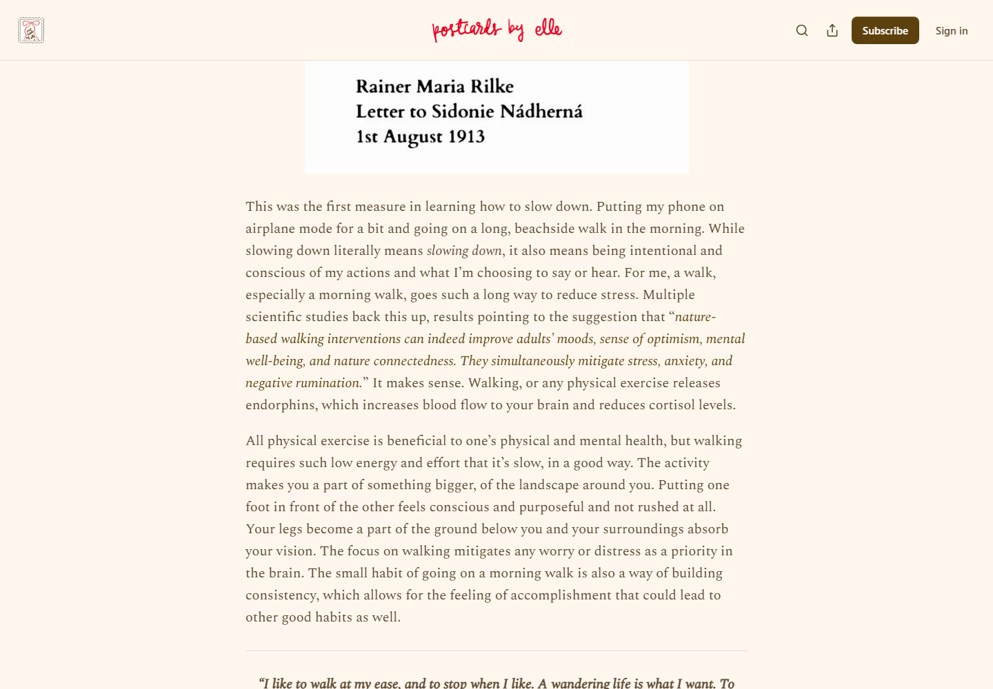
Representative desktop article body showing the source page's reading rhythm, media, and local hierarchy.
Desktop article body2026-07-11
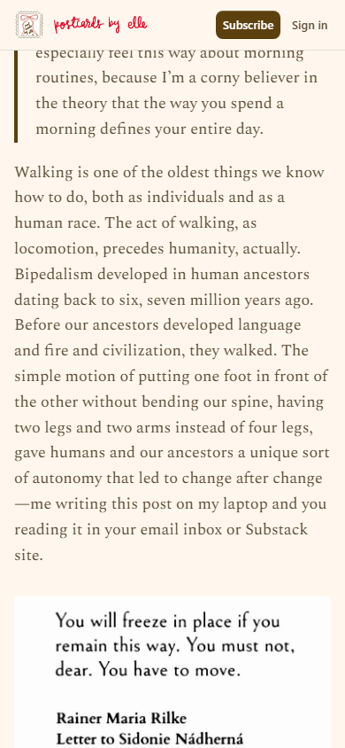
Representative mobile article body showing how the source page adapts its reading rhythm, media, and local hierarchy.
Mobile article body2026-07-11

The system behind the mood.

Typography

  • Lora handles publication/article titles and section headings; Spectral handles the essay body.
  • Substack's system/SF/Arial stacks handle controls, forms, comments, and recommendation modules.
  • The three-family split clearly separates publication identity, reading voice, and platform mechanics.
  • Subtitle text is Lora 18/24px in a muted gray-brown.

Color and imagery

  • The article uses #fff7ed background, #5d4c37 primary text, #868480 muted text, dark brown controls, and a red handwritten publication mark.
  • The desktop inventory contained 22 images spanning identity, domestic photography, screenshots, story previews, avatars, and related thumbnails.
  • Nine images use lazy loading and responsive Substack CDN srcsets with WebP negotiation.
  • Varying image roles and widths create diary/syllabus rhythm instead of a repeated 16:9 content block.

Motion and interaction

  • Header height and logo transforms use about 125ms transitions.
  • Buttons, image controls, and link utilities generally use 250ms transitions.
  • No entrance or scroll-driven article reveal was observed.

Orientation is part of the story.

01
The fixed publication bar preserves subscribe and sign-in on both breakpoints.
02
A Table of Contents button is present, but no persistent numeric or linear progress indicator was observed.
03
Engagement/share controls appear near the opening and again after the essay; images expose view/restack utilities.
04
Comments/restacks tabs, related-content tabs/cards, and two signup surfaces form a substantial platform tail.

Access, weight, and reader trust.

Accessibility

  • An empty H1 appears before the article-title H1, likely from publication branding.
  • All image elements had alt attributes, but seven were empty and several belonged to meaningful article images.
  • Nine links lacked visible text and aria-labels; many appeared to be image wrappers or platform utilities.
  • Several controls measured 32x32px or 40x40px, and #868480 on #fff7ed is about 3.5:1, below 4.5:1 for the 18px regular subtitle.

Performance restraint

  • Responsive CDN images, WebP negotiation, and lazy loading are positive for a media-rich essay.
  • Comments, recommendations, repeated signup surfaces, and platform controls add a large DOM after the article.
  • A delayed subscription modal appears after scrolling, adding interaction cost and an interruption state.
Readability 5/5
Orientation 4/5
Narrative pacing 5/5
Responsive adaptation 4/5
Media integration 5/5
Accessibility 3/5
Performance restraint 3/5
Transferability 4/5

Borrow the mechanism.

Narrative section names

Prelude, interlude, and postlude create memorable landmarks without documentation language.

Distinct reading and UI voices

Editorial type carries the essay while a neutral utility stack carries product controls.

Layered first viewport

Title, subtitle, engagement, epigraph, section heading, and one decisive image provide multiple entry hooks.

Mixed media roles

Photography, screenshots, previews, quotations, and lists reset attention in different ways.

Community after meaning

Immediate counts establish social life while the full conversation waits until the essay closes.

Keep the lesson. Leave the signature.

  • Do not turn this warm palette, Lora/Spectral pairing, or handwritten mark into a generic editorial preset.
  • Do not interrupt readers with a subscription modal before they have chosen to convert.
  • Do not leave meaningful photographs/screenshots with empty alt text or use sub-44px touch targets.
  • Do not let platform modules blur the editorial endpoint or load the whole community tail eagerly.

What this asks of the frontend.

01
Use a desktop max-width near 728px and 16px mobile gutters with media variants for full, inset, and preview widths.
02
Preserve a 1.6 body line-height, here 20/32px desktop and 18/28.8px mobile.
03
Model epigraph, section, paragraph run, quote, image/caption, related-story embed, resource list, and postlude as semantic content blocks.
04
Recompose header utilities with grid/flex areas so Share can separate on desktop and join engagement on mobile.
05
Lazy-load below-fold media with reserved dimensions, keep the first decisive image eager, and defer comments/recommendations until near viewport.

Read the dated learning file for the full observation log.

The entire scroll, preserved.

Show desktop full-scroll overview Compressed full-scroll desktop overview of the original Postcards by Elle on Substack page, showing overall pacing rather than readable text detail.
Show mobile full-scroll overview Compressed full-scroll mobile overview of the original Postcards by Elle on Substack page, showing overall pacing rather than readable text detail.