Longform Context UX
Study 02/08Captured 2026-07-11

Learning Adventures AI typography demoTypography Specimen

Notes on Remix 3 — index

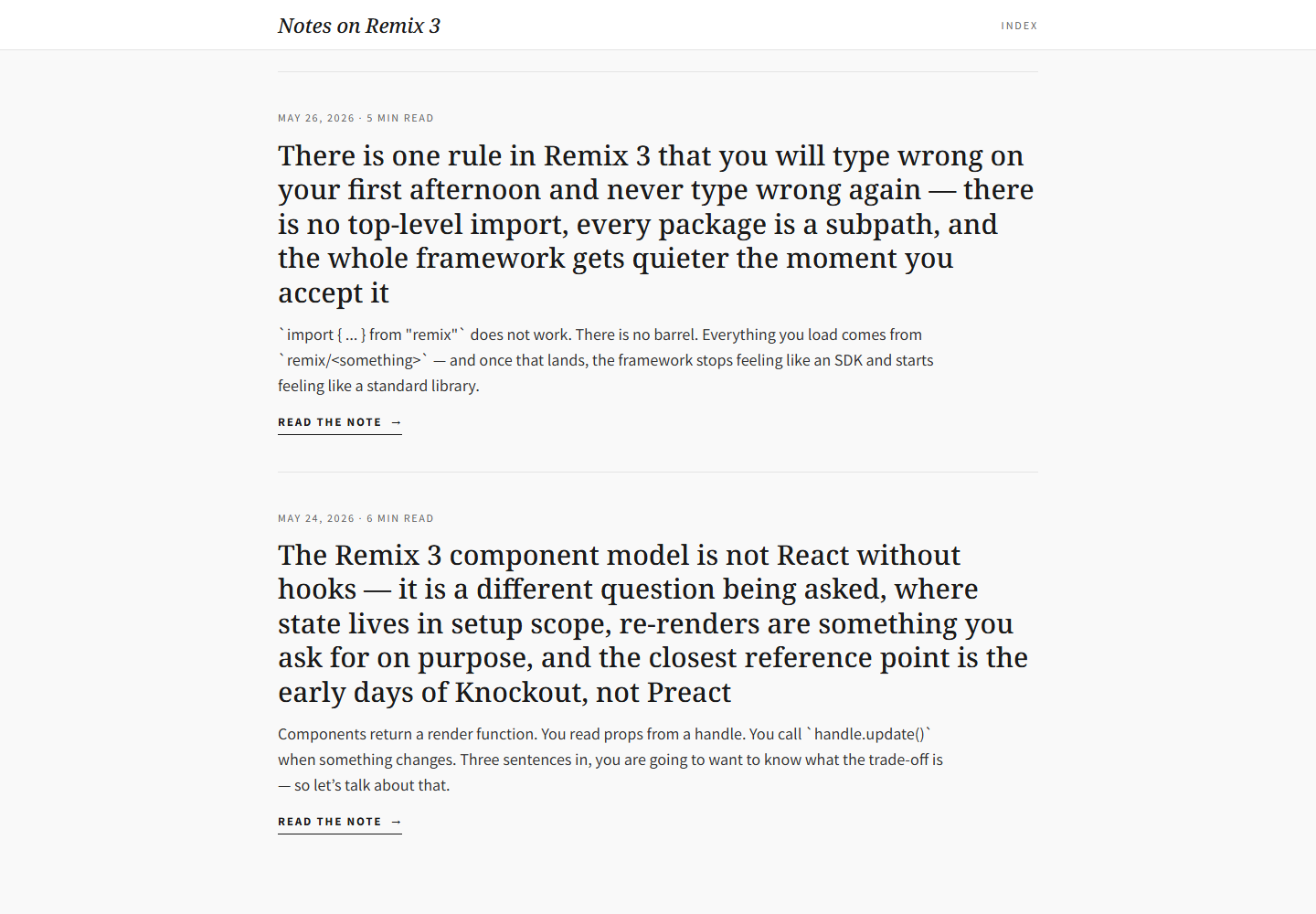
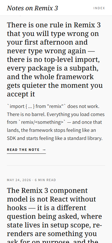
Three note previews repeat a semantic rhythm of metadata, proposition, excerpt, CTA, and divider without using cards or imagery. Responsive behavior is a clean reflow: headline sizes reduce while the 18px excerpts and 20px intro retain their reading size.

Open the original article

Verdict

A disciplined typographic index turns unusually long thesis-like titles into the main browsing affordance, but the supplied URL does not provide evidence of deep long-article reading behavior.
Evidence limits. Linked note pages were outside the assigned capture set, so article-body behavior remains unverified. The source is a mutable deploy preview captured on 2026-07-11.

What changes, and what merely resizes.

This evidence pair keeps the first viewport constant enough to compare hierarchy, media priority, and the cost of adaptation. Classification: reflowed.
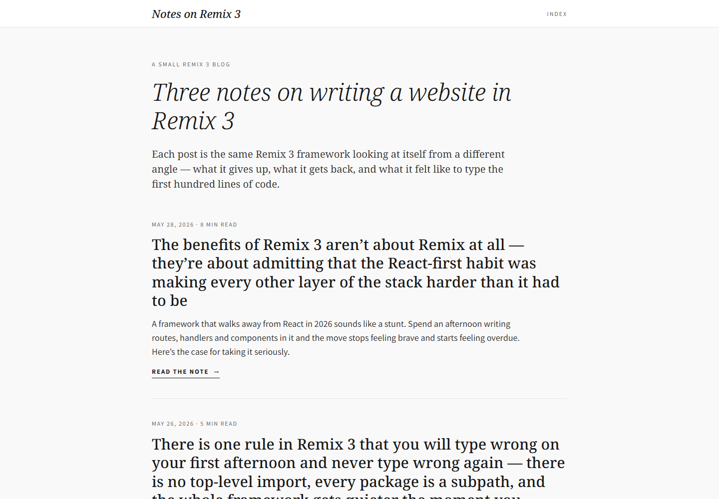
Desktop first viewport showing the original page hierarchy and composition.
Desktop, 1440 × 10002026-07-11
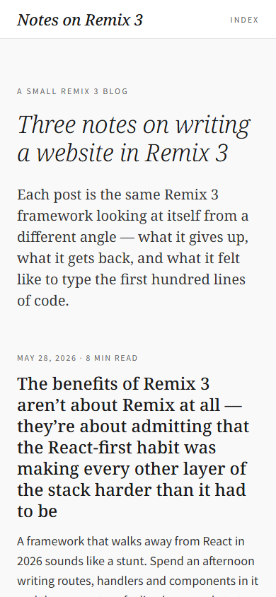
Mobile first viewport showing how the original page adapts its hierarchy and composition.
Mobile, 390 × 8442026-07-11

How the article spends attention.

  1. 01 Sticky masthead

    A 55px bar with the italic publication name and an Index link.

  2. 02 Collection introduction

    Small publication label, italic H1, and one-paragraph description.

  3. 03 Three note previews

    Each repeats date/read time, linked long H2, sans-serif excerpt, and explicit Read the note action.

  4. 04 Dividers and quiet ending

    Hairlines and generous vertical space separate propositions without cards.

  5. 05 Provenance footer

    Build note plus an explicit bolde.com typography credit.

Two compositions, one editorial promise.

Desktop observations

  • The main column is centered at 880px with 24px gutters and an 832px working width.
  • Headlines use the full working width while intros/excerpts cap at 740px.
  • The H1 is 48/57.6px and linked H2s are 30/37.5px.
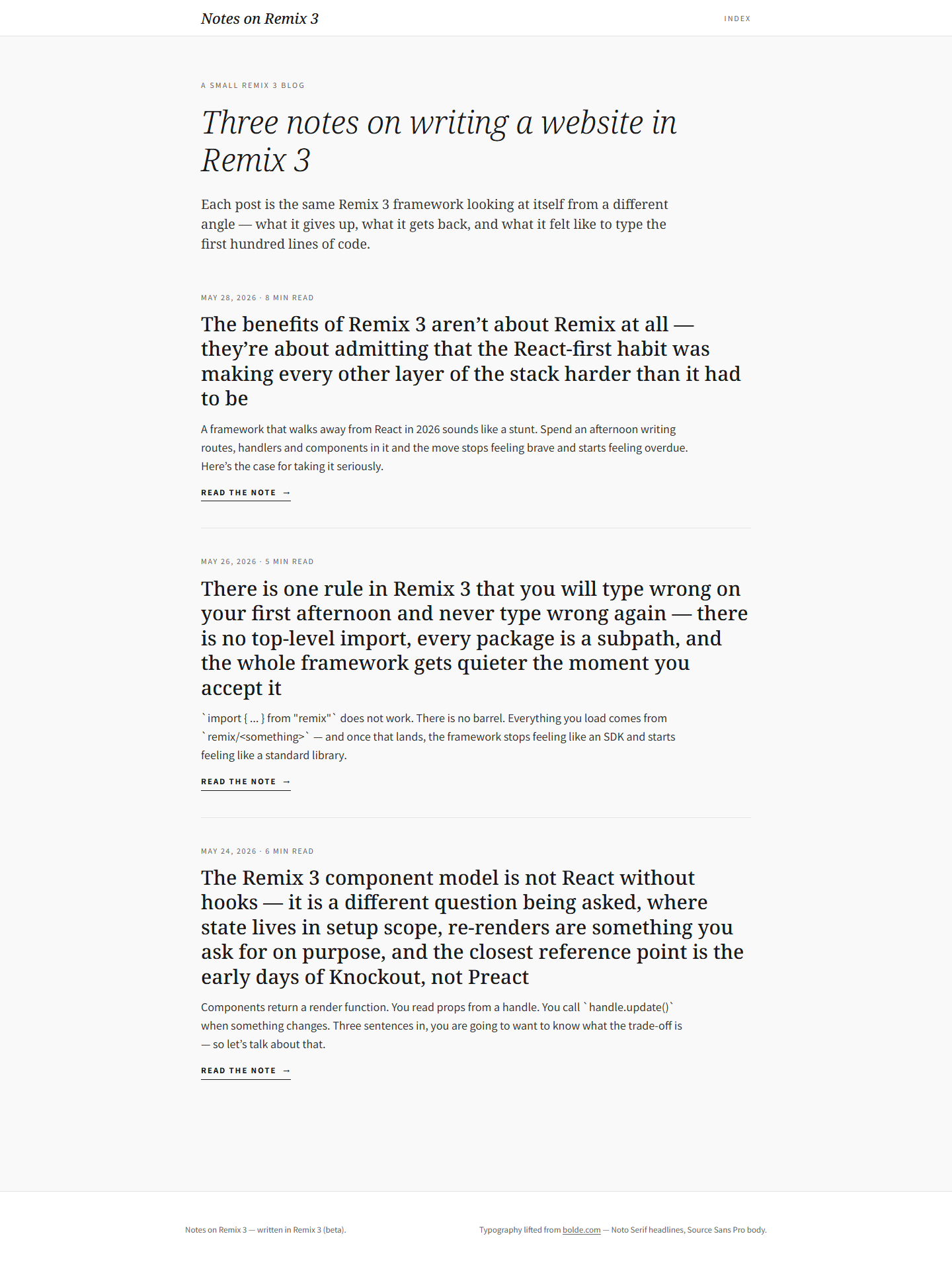
  • The complete index is about 1,919 CSS pixels tall, making the set easy to comprehend as one collection.

Mobile observations

  • The 390px viewport keeps 24px gutters, producing a 342px content column.
  • H1 reduces to 34/40.8px and H2s to 24/30px.
  • Intro and excerpt sizes remain 20/30px and 18/27.9px, protecting paragraph readability.
  • The header and semantic order remain unchanged; long headlines simply wrap into taller blocks.
  • No new mobile menu or utility layer is introduced for the three-item set.

A representative reading beat

Representative desktop article body showing the source page's reading rhythm, media, and local hierarchy.
Desktop article body2026-07-11
Representative mobile article body showing how the source page adapts its reading rhythm, media, and local hierarchy.
Mobile article body2026-07-11

The system behind the mood.

Typography

  • Noto Serif handles publication identity, H1, H2s, and the intro; Source Sans Pro handles metadata, excerpts, CTAs, and footer.
  • The H1 uses italic weight 300 with slight negative tracking; H2s use weight 500 upright.
  • Metadata is small uppercase/tracked sans, while actions use weight and underline rather than accent color.
  • The serif/sans contrast separates argument from logistics.

Color and imagery

  • White background, #1a1a1a headings, #333 body copy, and #666 metadata form the complete palette.
  • The page has no images, video, audio, CSS background images, cards, shadows, or color blocks.
  • Typography and whitespace are the only visual assets.

Motion and interaction

  • The only notable computed motion is a 150ms color transition on the three linked H2s.
  • There are no entrance animations or scroll effects.

Orientation is part of the story.

01
The sticky masthead provides publication home and index orientation.
02
Every note has a large linked heading plus an explicit Read the note action.
03
Date and estimated reading time appear before every title.
04
There is no search, share, progress, table of contents, or recommendation carousel on the index.

Access, weight, and reader trust.

Accessibility

  • The outline is one H1 followed by three H2s and all nine anchors had accessible names.
  • The Index link measured roughly 40x15px, below a 44px touch-target recommendation.
  • Explicit CTA text was about 24px high, though each note also has a much larger linked heading target.
  • Small tracked metadata should still be checked at zoom despite #666-on-white contrast.

Performance restraint

  • The page has no media and only nine links, so the content payload is small.
  • The main remaining cost is two web-font families; font-display and compatible fallbacks matter.
  • Netlify's deploy-preview drawer was hosting chrome and was removed from reference screenshots.
Readability 5/5
Orientation 4/5
Narrative pacing 5/5
Responsive adaptation 4/5
Media integration 1/5
Accessibility 4/5
Performance restraint 5/5
Transferability 5/5

Borrow the mechanism.

Title as proposition

Let the headline contain the argument so it works as both content and visual anchor.

Unequal measures

Give headlines more width than supporting prose to create distinct textures.

Semantic repetition

Metadata, title, excerpt, CTA, and divider create reliable rhythm without a card component.

Protect paragraph size

Compress display type on mobile before shrinking reading text.

Visible provenance

Credit the typographic source in the footer instead of presenting inspiration as original.

Keep the lesson. Leave the signature.

  • Do not describe this supplied URL as a long-form article; it is an index.
  • Do not use tiny uppercase metadata without touch, zoom, and low-vision checks.
  • Do not assume zero imagery transfers to evidence-, place-, or product-led content.
  • Do not copy the italic-serif appearance without equally specific titles and deliberate spacing.

What this asks of the frontend.

01
Use a sticky 55px masthead and a centered max-width near 880px with 24px gutters.
02
Define separate display and supporting-prose width tokens, here about 832px and 740px.
03
Render each note as semantic list content with time, linked H2, excerpt, and explicit action.
04
Reduce only H1/H2 at mobile while retaining 18px excerpts and 20px intro text.
05
Increase the Index hit area with padding or a pseudo-element without changing its visual scale.

Read the dated learning file for the full observation log.

The entire scroll, preserved.

Show desktop full-scroll overview Compressed full-scroll desktop overview of the original Learning Adventures AI typography demo page, showing overall pacing rather than readable text detail.
Show mobile full-scroll overview Compressed full-scroll mobile overview of the original Learning Adventures AI typography demo page, showing overall pacing rather than readable text detail.