Longform Context UX
Study 06/08Captured 2026-07-11

PenguinCultural Campaign

Lit in Colour

Lit in Colour combines sticky macro navigation, saturated chapter fields, custom illustration, quotes, statistics, and system diagrams. Desktop split evidence scenes become carefully ordered vertical chapters on mobile, while core identity loading and the complexity of scrollmation expose important accessibility and resilience cautions.

Open the original article
First viewport of the original Penguin page, captured 2026-07-11.

Verdict

A vivid campaign report that turns research into a causal, navigable narrative of evidence, barriers, and action without losing its institutional purpose.
Evidence limits. This single-session inspection is not a user study, analytics report, or performance benchmark. Full-page capture cannot preserve every scrollmation state; white gaps are capture artifacts, so hero, body, and live viewport evidence carry detail.

What changes, and what merely resizes.

This evidence pair keeps the first viewport constant enough to compare hierarchy, media priority, and the cost of adaptation. Classification: recomposed.
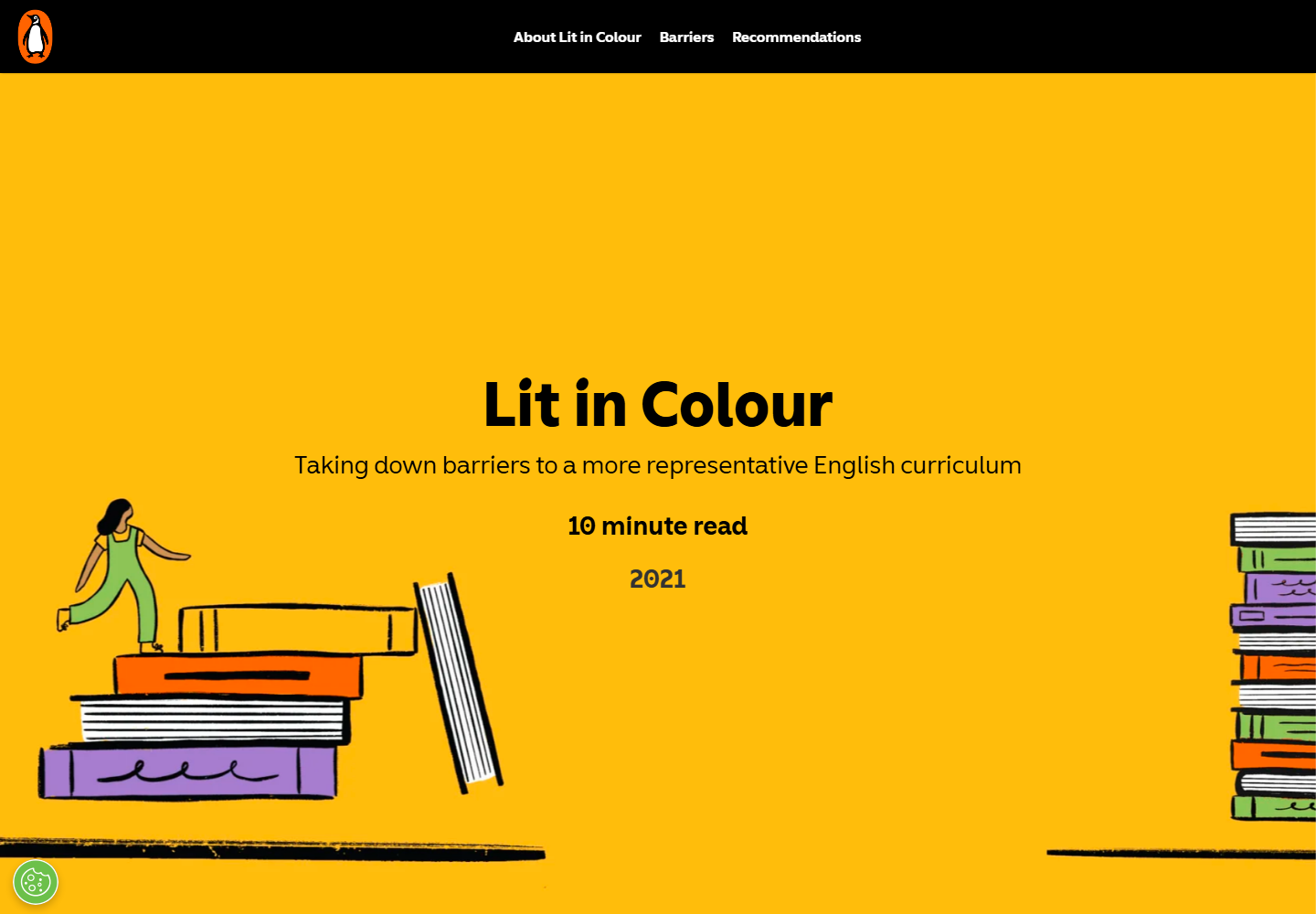
Desktop first viewport showing the original page hierarchy and composition.
Desktop, 1440 × 10002026-07-11
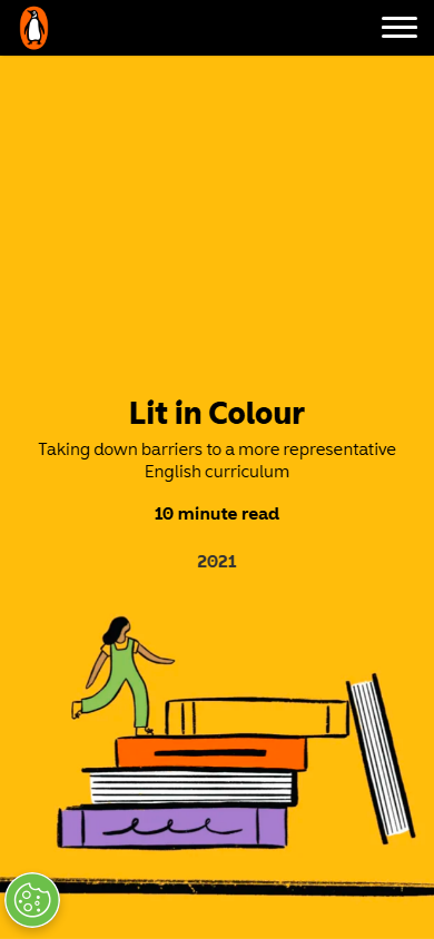
Mobile first viewport showing how the original page adapts its hierarchy and composition.
Mobile, 390 × 8442026-07-11

How the article spends attention.

  1. 01 Campaign hero

    Penguin identity, report title, subtitle, ten-minute read, year, and book illustration establish a public-interest report.

  2. 02 Purpose and evidence

    Quotation, initiative introduction, research framing, statistics, and Why does this matter explain the stakes.

  3. 03 System map

    Illustrated decision-chain content shows how texts reach classrooms and where choices are constrained.

  4. 04 Barrier chapters

    Confidence, canon, resources, teacher demographics, and book discovery become distinct visual scenes.

  5. 05 Action chapters

    Audience-specific recommendations, teaching resources, Penguin commitments, and credits complete the causal arc.

Two compositions, one editorial promise.

Desktop observations

  • A roughly 80px black sticky header keeps three report anchors visible and marks the active phase in orange.
  • The centered hero H1 is approximately 68px/68px and is framed by book-stack illustration.
  • Body chapters alternate centered 600px prose with split evidence, quote panels, diagrams, and oversized statistics.
  • Green, purple, yellow, black, and warm-white full-width scenes make the report's narrative modes visible.

Mobile observations

  • The header compresses to about 50px with Penguin mark and hamburger; macro navigation becomes an off-canvas panel.
  • The H1 becomes about 28px/31px, while read time, year, and illustration remain part of the opening composition.
  • Body text becomes approximately 16px/27px in a 340px column with 25px side gutters.
  • Desktop split statistics and prose become ordered vertical scenes, while decorative objects crop to the edges.

A representative reading beat

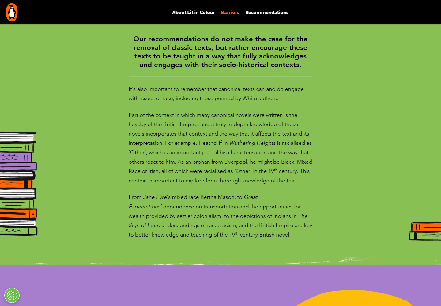
Representative desktop article body showing the source page's reading rhythm, media, and local hierarchy.
Desktop article body2026-07-11
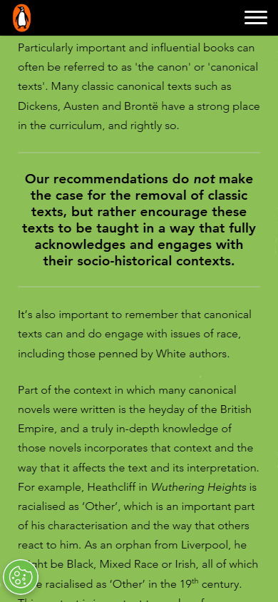
Representative mobile article body showing how the source page adapts its reading rhythm, media, and local hierarchy.
Mobile article body2026-07-11

The system behind the mood.

Typography

  • Penguin Inclusive Sans Display carries the campaign H1, Penguin Inclusive Sans carries headings, and Avenir W05 carries prose.
  • Desktop body is approximately 18px/31px and mobile body approximately 16px/27px.
  • Statistics, quotes, explanation, and action use deliberately distinct type scales and compositions.

Color and imagery

  • Orange, yellow, green, purple, black, and warm near-white operate as semantic chapter fields.
  • Book stacks, people, classroom objects, and diagrams share one coherent illustrated world.
  • Statistics and quotations are integrated into the illustration grammar rather than placed in generic cards.

Motion and interaction

  • Scrollmation, fixed or sticky backgrounds, object movement, and staged reveals turn sections into scenes.
  • A prefers-reduced-motion rule was detected in the inspected stylesheets.

Orientation is part of the story.

01
Desktop exposes three named macro anchors with active-section state; mobile moves them into an off-canvas menu.
02
A ten-minute read estimate sets expectation in the hero.
03
Recommendations and teaching resources remain inside the report arc rather than becoming an unrelated sidebar.

Access, weight, and reader trust.

Accessibility

  • Many illustration and scene images expose descriptive alternative text, and the stylesheet includes reduced-motion handling.
  • Some links use generic wording such as Click here, reducing out-of-context clarity.
  • The Penguin logo was withheld behind a performance-cookie category before consent, breaking a core identity asset in the inspected state.

Performance restraint

  • The 32,000px desktop and 38,000px mobile journeys contain many fixed scenes, illustrated objects, and animated states.
  • No numeric transfer-size, Core Web Vitals, CPU, memory, or field-performance measurement was performed.
Readability 4/5
Orientation 4/5
Narrative pacing 5/5
Responsive adaptation 5/5
Media integration 5/5
Accessibility 4/5
Performance restraint 2/5
Transferability 4/5

Borrow the mechanism.

Research as causal narrative

Move from purpose and evidence through system barriers to audience-specific action.

Three-level orientation

Combine macro phase anchors, strong scene headings, and distinct background modes.

Evidence components

Give statistics, quotes, diagrams, and recommendations their own reusable visual grammar.

Responsive scene translation

Replace desktop spatial comparison with a meaningful vertical mobile order.

Keep the lesson. Leave the signature.

  • Do not make logos, navigation, or essential content dependent on nonessential cookie consent.
  • Do not let a single active scroll state carry facts that disappear in print, no-script, or reduced-motion use.
  • Do not use generic link labels when the destination or action can be named.

What this asks of the frontend.

01
Model the report as semantic sections with macro phases and typed prose, quote, statistic, diagram, and action blocks.
02
Render a complete linear document first and layer fixed scenes or transforms only as enhancement.
03
Expose active desktop navigation with aria-current and build the mobile drawer with focus management and Escape support.
04
Under reduced motion, remove pinning and transforms and show representative images inline.
05
Keep core identity assets first-party and consent-independent, with reserved dimensions and responsive sources.

Read the dated learning file for the full observation log.

The entire scroll, preserved.

Show desktop full-scroll overview Compressed full-scroll desktop overview of the original Penguin page, showing overall pacing rather than readable text detail.
Show mobile full-scroll overview Compressed full-scroll mobile overview of the original Penguin page, showing overall pacing rather than readable text detail.