Opening funnel
Give the title a broad measure, narrow the deck, then settle into a stable prose column.
Tubik StudioDesign Education
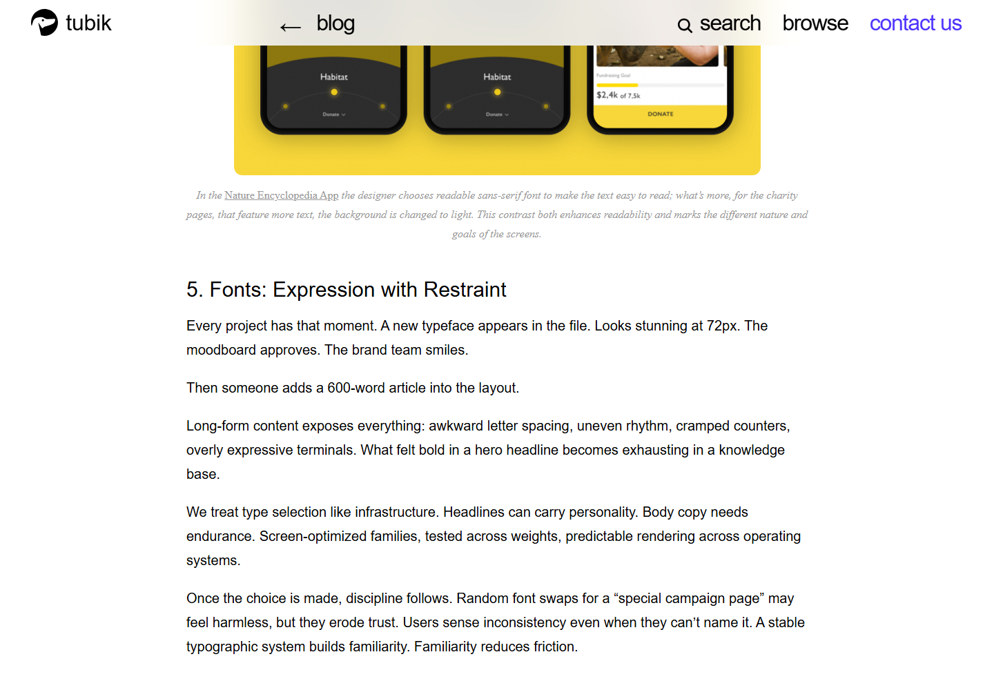
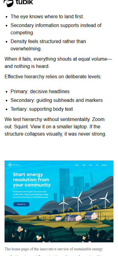
The article funnels from a broad 72px display title into a narrower deck and a stable 900px prose system, then periodically expands media to 1140px. Mobile is a real re-composition: utilities reorder, the fixed header simplifies, body type changes from 20/35px to 16/24px, and all evidence becomes a single 360px column.
Open the original article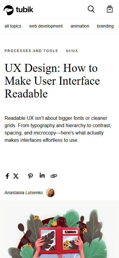
A confident studio article uses a neutral shell, strong chapter type, and wide evidence breakouts to make a very long design lesson scannable, though its desktop prose measure and heavy global DOM deserve restraint.
Responsive argument
This evidence pair keeps the first viewport constant enough to compare hierarchy, media priority, and the cost of adaptation. Classification: recomposed.

Story anatomy
Fixed Tubik/blog navigation with search, browse, contact, and a topic row.
Taxonomy, large H1, narrow explanatory deck, author, and share actions.
Colorful hero illustration followed by narrative setup and the legibility-versus-readability distinction.
One H2 with five numbered H3 lessons and large product examples.
Hierarchy, structure, writing, contrast/accessibility, personalization, and a final practical test.
Recommended reading, share/copy utility, newsletter, related case studies, tags, archives, categories, and studio footer.
Viewport behavior
Design language
Reader utilities
Tradeoffs
Transferable patterns
Give the title a broad measure, narrow the deck, then settle into a stable prose column.
Let media expand beyond prose only when it demonstrates a lesson the text cannot.
Use H2 for chapters and numbered H3s for resumable instructional sub-sections.
Keep interface color restrained so project examples provide the visual energy.
Reorder share, author, and metadata by reading priority instead of preserving desktop alignment.
Do not copy
Implementation
Read the dated learning file for the full observation log.
Full evidence

